When SolarCity NZ rebuilt its website in 2019, the design agency came back with something new: a hamburger menu on desktop. The kind of thing you’d normally see on mobile, tucked into the top corner, three horizontal lines expecting you to know what it means.
The brief had been to modernise the site. The agency’s view was that a clean hamburger kept the design uncluttered. The timeline was tight — a few weeks end to end. There was no time for user testing, no time to prototype alternatives. So we shipped it, knowing it was a risk. Any version of the new site was going to be better than what we had. And as it was, we had already decided to skip a lot behind the scenes (read: the entire CMS) to make sure we hit launch timelines. Sometimes you gotta do what you gotta do.
The hypothesis
I had a suspicion that desktop visitors weren’t recognising the hamburger as navigation. If you’d grown up with the web before mobile, three horizontal lines in a corner wasn’t obvious. The result would be visitors sitting on the page they landed on, not finding what they were looking for, and either bouncing or spending time hunting. Jakob’s law in full effect (no relation).
My hypothesis was by replacing the hamburger with a traditional horizontal navigation bar would help visitors find information faster, allow visitors to find more information (increase pages per session), reduce time on site (a counterintuitive success metric — faster time-to-information is good), and reduce bounce rate.
The experiment
I set up an A/B test using Google Optimize, splitting desktop traffic between the original hamburger navigation and a new horizontal nav. The test ran for two weeks across 984 sessions in the original variant and 849 in the challenger.
The results
The results were unambiguous.
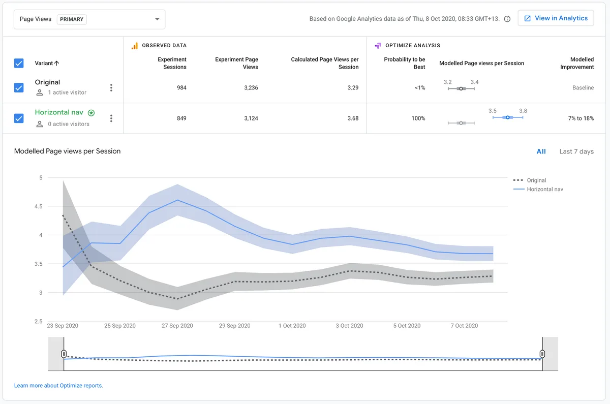
Pages per session improved from 3.29 to 3.68 — a 7–18% modelled improvement with 100% probability of the horizontal nav being the better variant. Visitors were exploring more of the site.
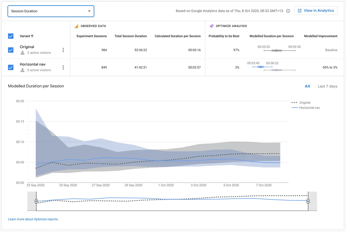
Session duration fell from 3:16 to 2:57. That sounds like a regression but it’s the opposite — visitors were finding what they needed faster. Less time wandering, more time on the right page.
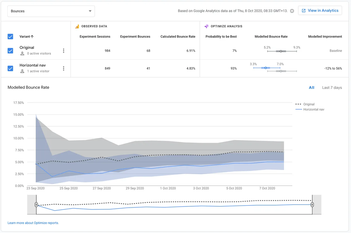
Bounce rate dropped from 6.91% to 4.83% — a 93% probability that the horizontal nav was responsible, with a modelled improvement of up to 56%.
We shipped the horizontal nav immediately.